Creating a brand identity and website that positions renewable energy as a harmonious partnership with nature, not domination of it.
ROLE
Solo Brand + Product Designer
TOOLS
Figma
Framer
Claude
WHAT I DESIGNED
Complete brand identity (logo, color system, typography)
Marketing website (responsive design)
Design system
Marketing materials (billboards, posters)

THE QUICK STORY
The Problem
My Approach

Patterns Found in Nature
I decided to design a logo based on radial growth, six segments like petals opening or looking down at a tree canopy from above. The geometry feels organic (nature-inspired) and systematic (solar arrays, wind turbines) at the same time. When placed on forest textures, it looks like it grew there naturally. The mark represents both natural growth patterns and renewable energy infrastructure—showing they're not separate, they're connected.
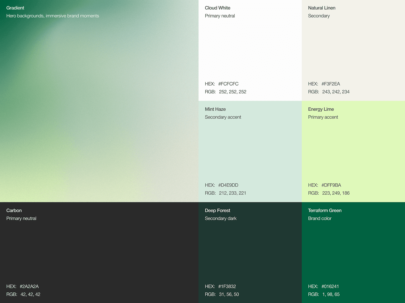
Research on color psychology revealed deep greens are associated with stability, growth, and established institutions (banks, universities), exactly the credibility enterprise buyers need. But pairing deep green with bright accents creates optimism without feeling startup-y or frivolous.
The palette says "we're rooted in something ancient (nature's systems) while moving toward something bright (renewable future)."
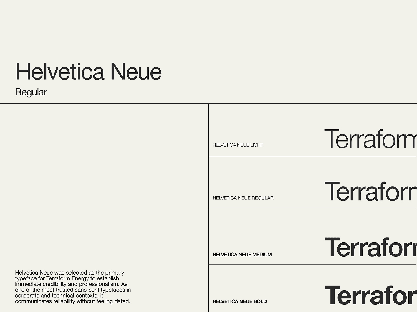
Analyzing trust-building in B2B contexts revealed that transparency and openness matter more than appearing powerful. Heavy typography can feel aggressive or closed-off. Light typography, with generous spacing, creates visual openness—literally more white space, more breathing room, more invitation to look closer.
I decided on Helvetica Neue Light exclusively for headlines, a strategic choice that expresses Terraform's philosophy through form. The lightness says "we're open, transparent, nothing to hide." The geometric precision says "we're systematic and reliable."
The Solution
Responsive Website Design
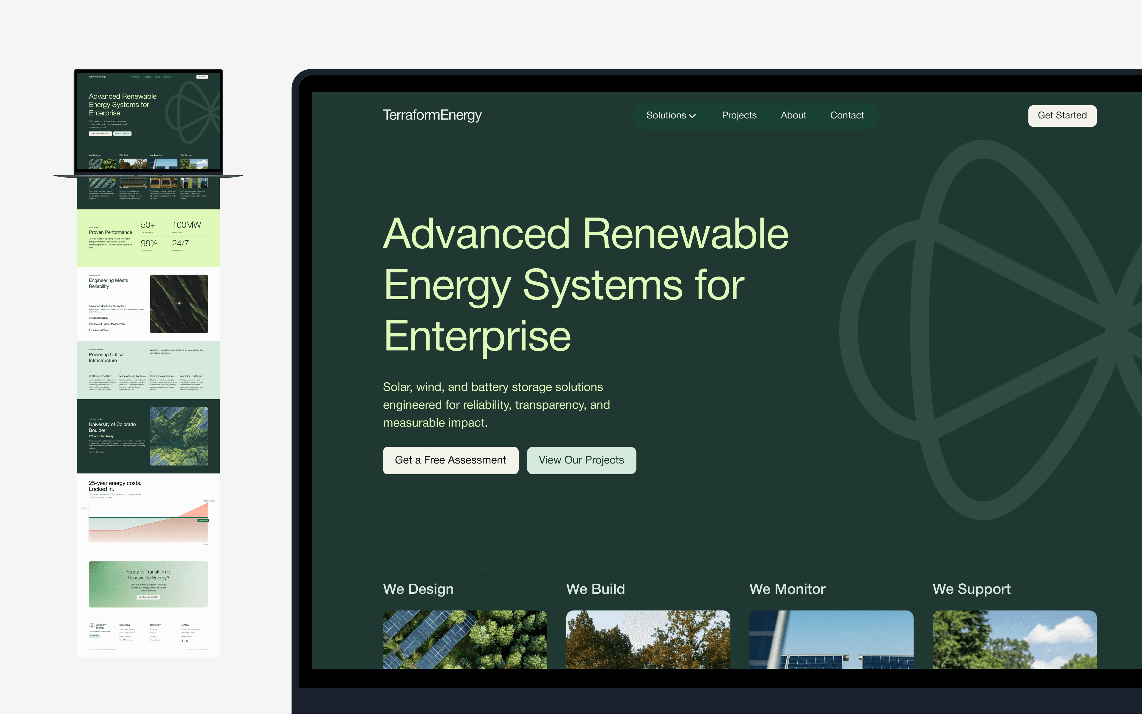
The website serves two parallel goals: giving enterprise decision-makers the proof they need, while expressing Terraform's nature-partnership philosophy through every design choice.
The entire experience flows like walking through a forest—information revealed progressively, generous breathing space between sections, natural light and organic compositions throughout. Users get the business proof they need, while experiencing Terraform's philosophy through the journey itself.
Cost Chart - Transparency as Strategy
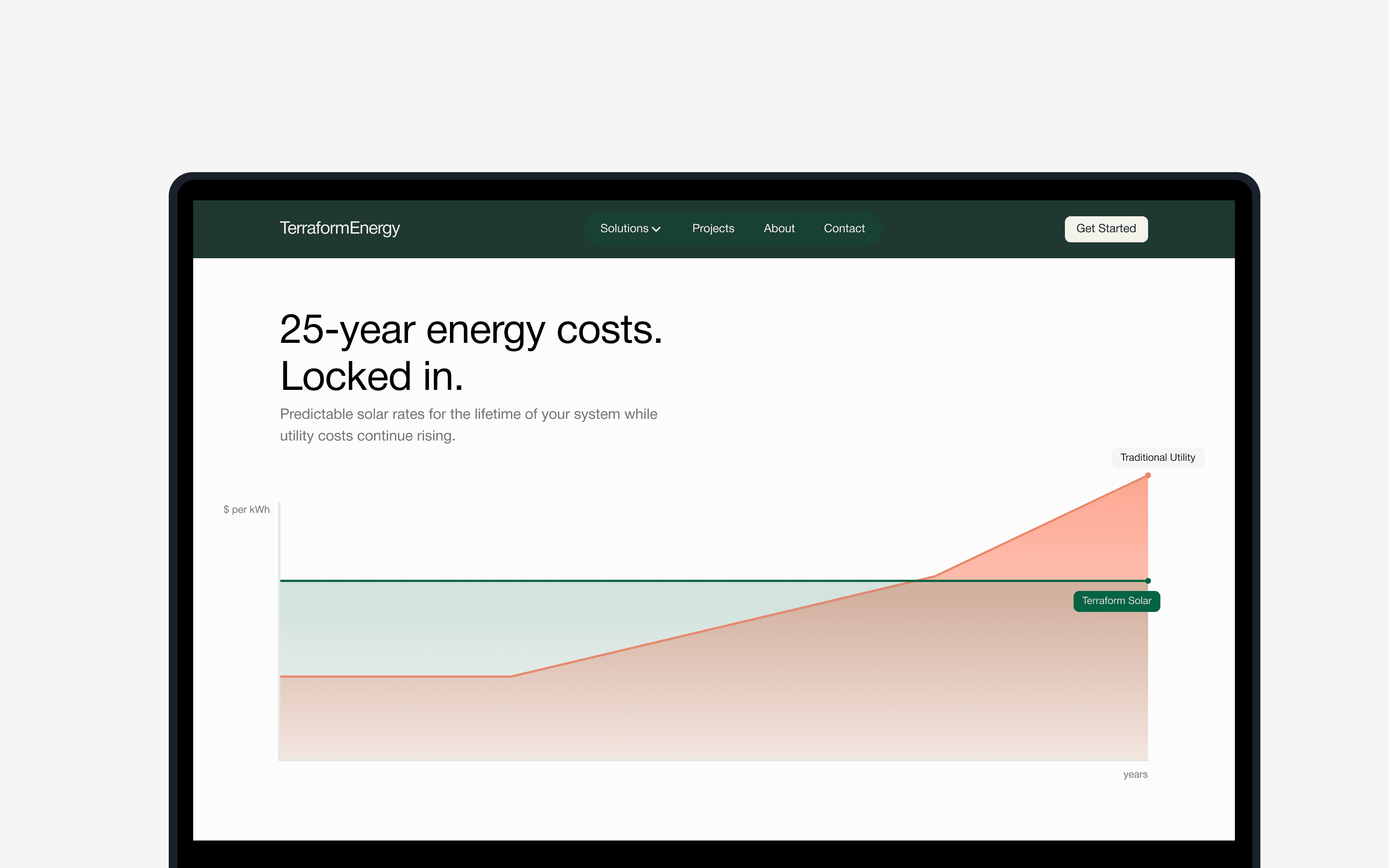
Enterprise facility managers are skeptical of renewable energy claims, they've heard overpromises before. This section serves their need for clear, honest financial comparison while expressing Terraform's commitment to transparency.
Minimal design with clean axes and simple labels. No flashy graphics, no aggressive calls-to-action. Just information presented honestly. This restraint builds more trust than overselling ever could.
Mobile - Focused Information Flow
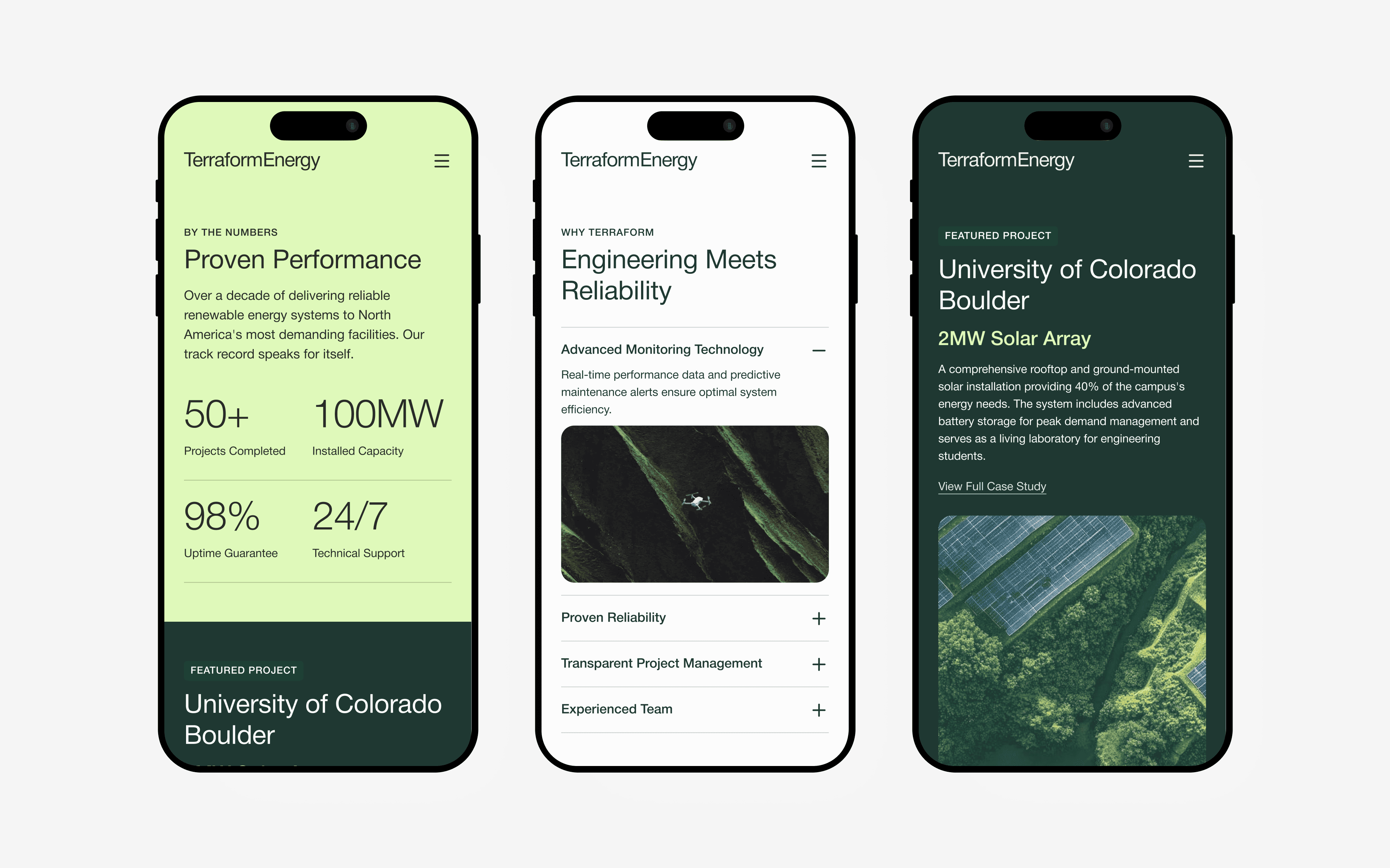
Enterprise decision-makers research on mobile during commutes, between meetings, in quiet moments. The mobile experience serves their need for quick, focused information while maintaining Terraform's organic, nature-connected philosophy.
Every screen maintains soft typography, organic compositions, and breathing space, even when space is limited. The mobile experience says: "We adapt to serve your needs while staying true to our principles."
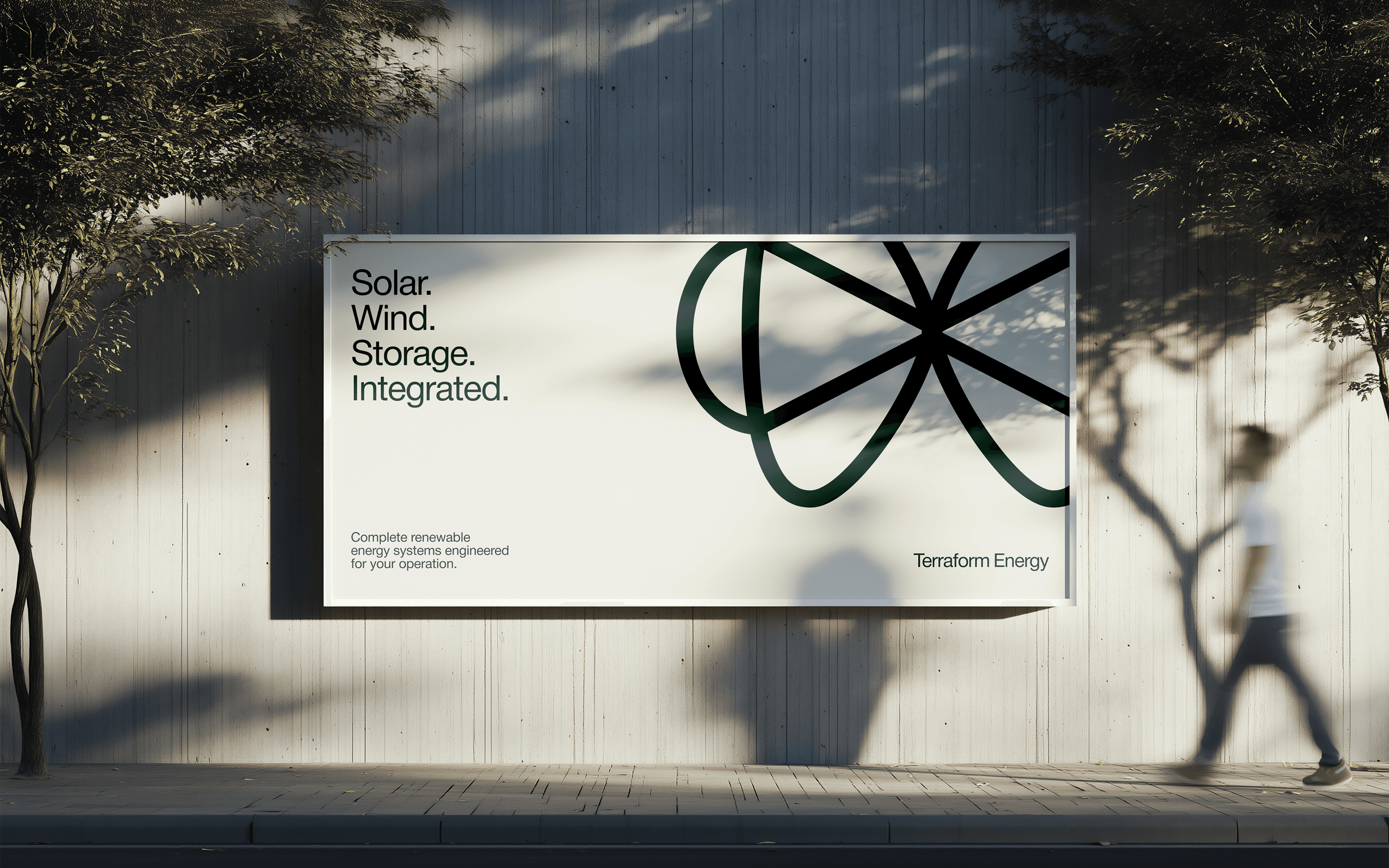
Billboard - Urban Calm in Visual Noise

Highway billboards typically scream for attention: bright colors, huge text, aggressive messaging. This creates visual pollution and misses strategic opportunities with thoughtful viewers. Terraform's billboard serves drivers differently: by offering calm in chaos.
The billboard demonstrates Terraform's approach by existing peacefully in urban context.
What I Learned
01
Strategy comes from philosophy, not tactics
Early versions focused on tactical design choices (what fonts? what colors?) without first establishing philosophical grounding. Once I defined Terraform's core philosophy (partnership with nature, not domination) every strategic decision became clear. The strongest design systems emerge from coherent philosophy, not from accumulating good-looking choices.
02
Serving users and expressing concept are the same thing
I initially saw "user needs" and "brand philosophy" as competing priorities—serving enterprise buyers (need proof, credibility, ROI) vs. expressing Terraform's nature-connected concept. But the breakthrough came from realizing they're aligned. When brand philosophy is genuine, serving it and serving users become the same action. The design doesn't choose between them, it does both simultaneously.
03
Constraint is where concept proves itself
Mobile design was the true test. Easy to have generous whitespace and soft gradients on desktop. Hard to maintain that philosophy when you only have 375px width. The mobile experience proved the concept was real, not just a desktop aesthetic.
Thanks for reading
If this case study resonates with how you think about design: research-driven, user-centered, and focused on real impact. I'd love to talk about opportunities with your team.