Vesta
ROLE
SCOPE
TOOLS
Claude, Figma
My Approach
Fragmentation is the real anxiety trigger
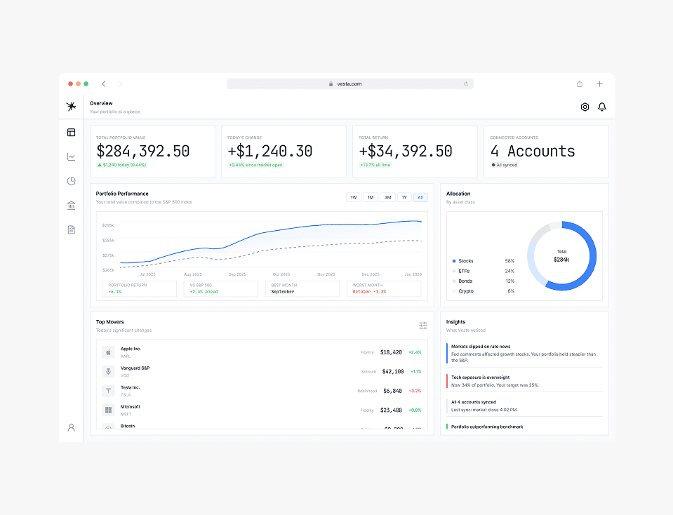
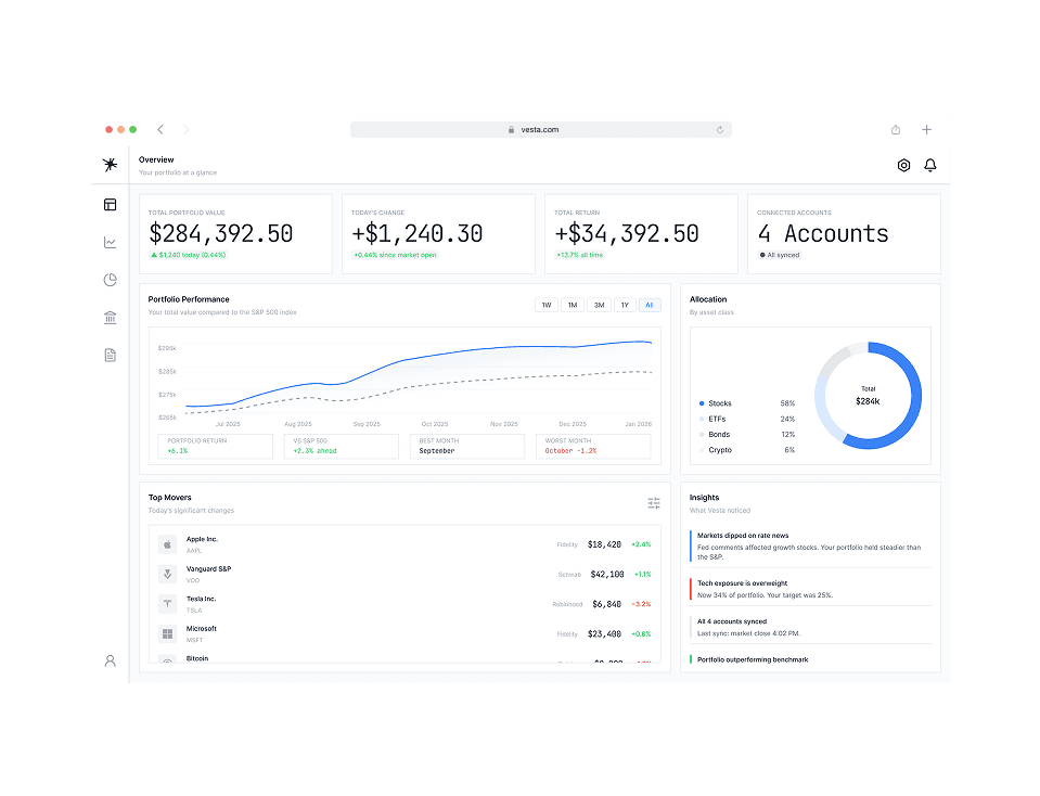
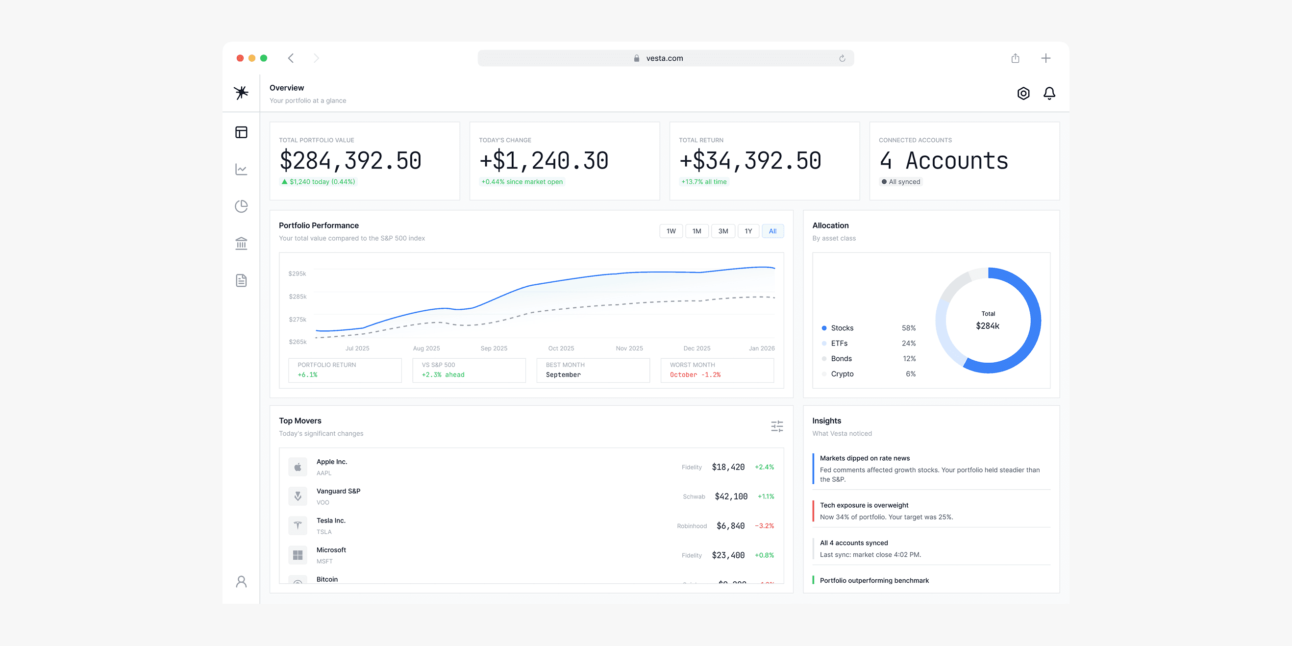
Most retail investors don't lose sleep over bad performance — they lose sleep because they can't see the full picture. Money spread across four brokers, a spreadsheet, two apps. When markets move, the stress isn't just financial — it's the hunt. I designed Vesta around one core principle: end the hunt. Every screen reinforces that the full picture is here, consolidated, always current.
Inform, never alarm
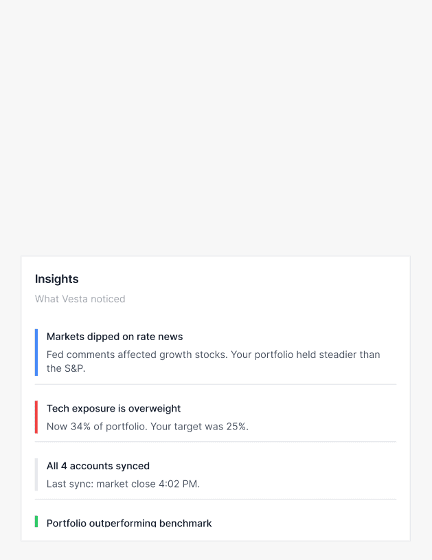
Most financial apps are designed to create engagement through anxiety with red numbers, urgent alerts, real-time price ticks. I made a deliberate choice to go the other way. Vesta uses desaturated semantic colors, end-of-day data instead of live ticks, and always pairs a number with context. A portfolio down €4,200 looks different next to "+14.6% year to date."
Every number needs a companion
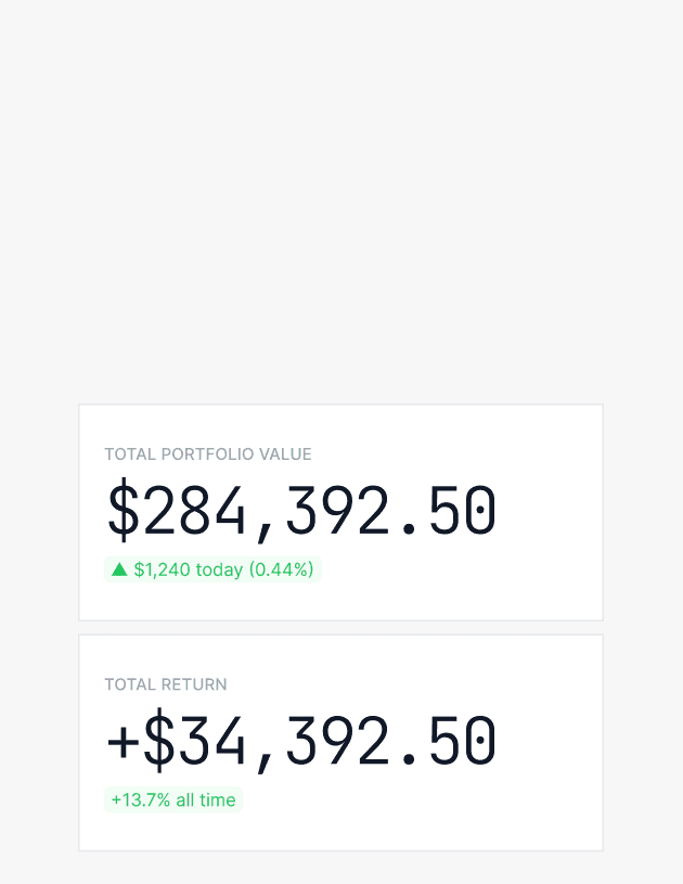
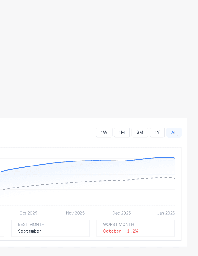
A single number in isolation is either meaningless or alarming and depends entirely on what's sitting next to it. I designed every metric with a companion: a delta showing direction or a period providing context. The hero portfolio value sits next to today's change and all-time return. Information only becomes understanding when it has reference points.
Key Takeaways from Research
01
Exclusion decisions are as important as inclusion decisions
I spent a session deciding what Vesta would not show — no global news feed, no analyst ratings, no trading, no real-time price ticks. Every exclusion came from a design principle, not a technical constraint. Removing things that didn't serve the anxious emerging investor made every screen that remained feel focused and intentional.
02
Design principles only work if they reach the token level
"Inform, don't alarm" is easy to write in a document. Making it real meant desaturating the red in the semantic color tokens, choosing font weight 300 for hero numbers so they feel precise rather than urgent, and writing microcopy in a calm register throughout. The principle had to live in every decision or it lived nowhere.
03
A two-layer token system is worth the upfront investment
Building primitives and semantic aliases before touching a single screen felt slow at first. By the third screen it was paying back every minute. Changing the card border radius updates fifteen card instances simultaneously. The system made me faster the longer I used it, which is exactly what a design system should do.
Key Takeaways from Research
01
UX documentation is the real portfolio piece
I built a full UX foundation before opening Figma — user definition, content inventory per screen, information architecture, six design principles. Reviewers who open this project can see not just what I designed but why. The thinking is documented. That's the difference between a portfolio that shows finished screens and one that shows how a designer thinks.
02
One screen done exceptionally beats five screens done adequately
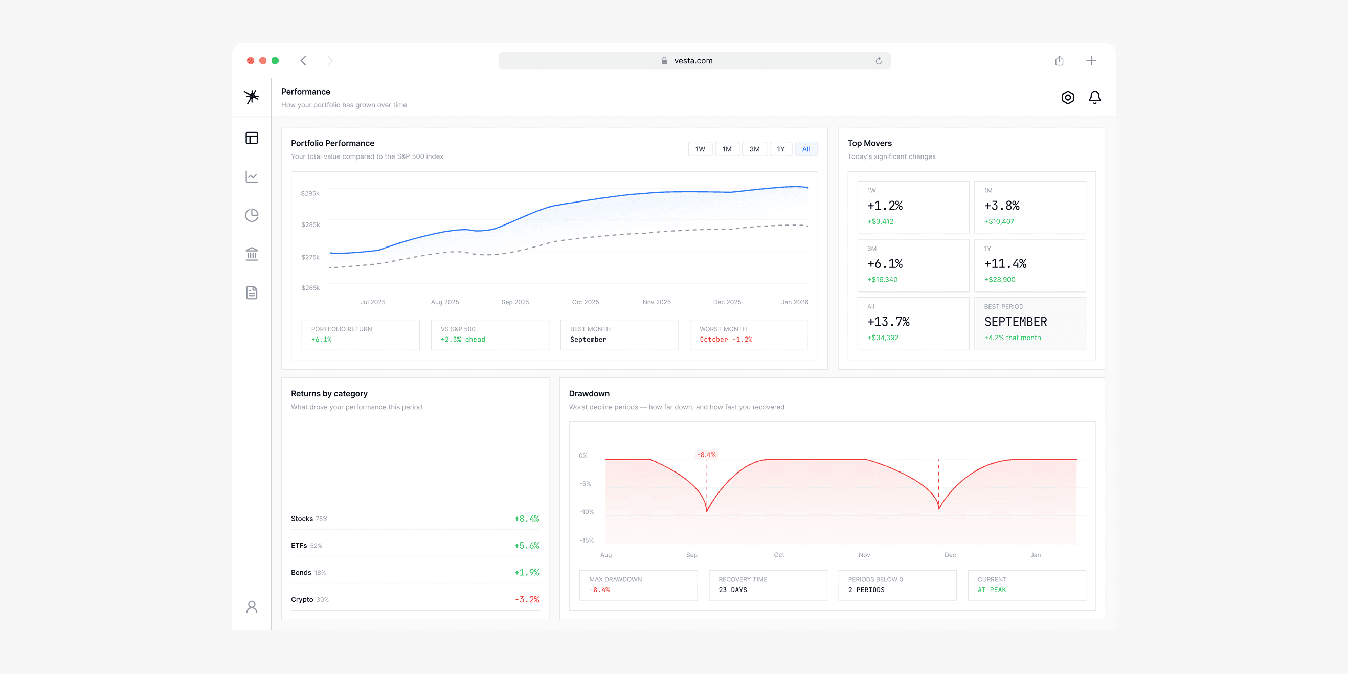
With a tight deadline I made a conscious decision to scope the MVP to three screens rather than rush five. The Overview, Performance, and Allocation screens each have a complete design rationale, a resolved layout, and real content. Screens four and five are documented in wirefraEvery number needs a companionmes. Honest scoping is a stronger signal than inflated output.
03
Financial data visualization is an emotional design problem
I came into this project thinking data viz was primarily a clarity problem, working through every chart decision taught me it's equally an emotional problem. The weight of a line, the saturation of a color or the presence or absence of a benchmark shapes how a user feels about their financial reality. Designing for orientation rather than vigilance changed every visual decision I made.